Now before I start off with telling you about the different design stages of this reading nook, I will tell you about the primary requirements of the client, Mr. Dilip.
So, the main project requirements were as follows-
This is a 2BHK apt in Ravet. It was a renovation project. So, a few things were to be added, few were to be modified and some were to be left as it is and the furniture around them were to be designed in a way so it could complement the existing theme.
The main requirements for the living room were the TV unit+ mandir, the reading corner with a capacity of over 100 books (since my client is a voracious reader) and a safety door at the entrance.
I will be sharing the designs of the safety door and the TV unit in another post along with their design details. This post is going to be exclusively about the cosy reading corner.
Now, having a cosy reading nook in a living room is a bit of an unusual requirement. But since there wasn’t any other space in the house for it, we decided to make it in the living room.
The Design Journey
Design 1
I started off with making it in a conventional way with the workstation space below and the shelves on the wall above it, like you usually see in a study space.
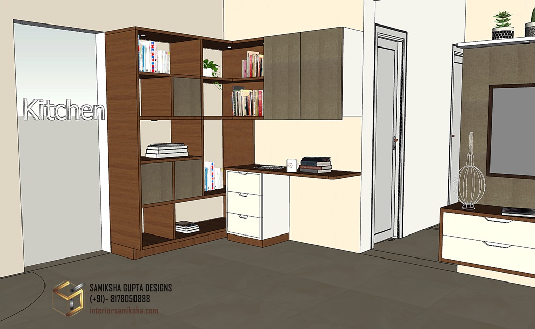
Since I had to fit in about a 100 books, I also added a full-fledged book stand beside the kitchen entrance giving this whole study arrangement an L-shape.
Obviously enough, this was not at all a “cosy” set-up and never passed the draft stage.
Design 2
Then I started off with making some designs which had cushioned seat or a small day-bed sort of arrangement.
I proposed this second design which had a settee-cum-bed below and L-shaped shelves above for keeping the books.
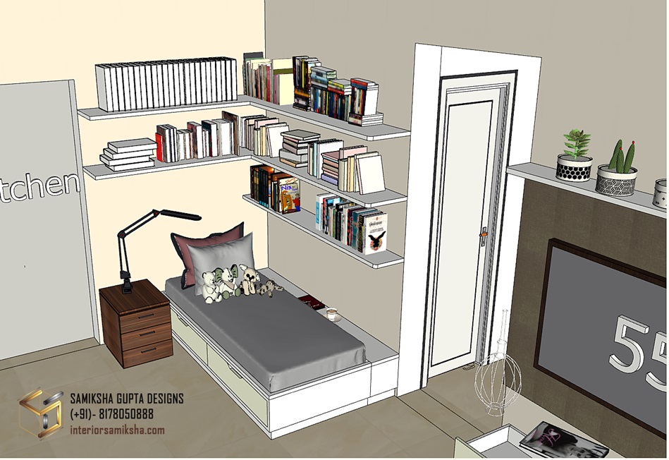
This settee-cum-bed also had storage inside, accessible as drawers in the front.
I added a side table so as to keep a lamp there for reading.
Since the bed was right below the shelves, I gave an extra platform space beside the shelves for keeping your cup of tea to relax, have tea and read.
I liked this design, personally. But this didn’t suit the aura of a living room. It looked more like a setup that one would like in their bedroom or in their personal library space, maybe.
Design 3
And then I changed the design further. Instead of making it look like a day bed, I changed it into an L-shaped settee seating arrangement with shelves above for books.
This looked like a more conventional, simpler option.
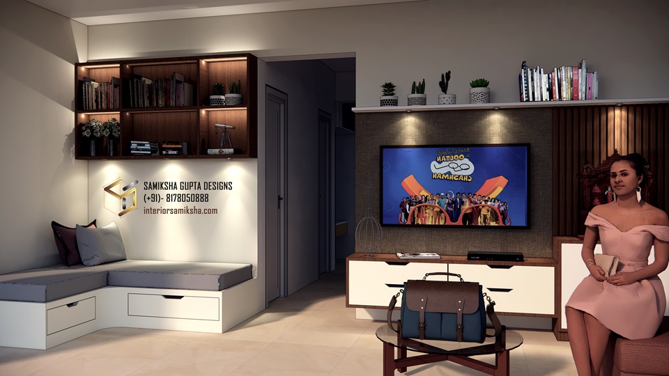
But because this looked too simple, we decided to make it fancier.
Design 4
Mr. Dilip suggested adding partitions on the sides of this corner so as to make it more cosy without compromising with the aesthetics of the entire room.
Here’s what I proposed next.
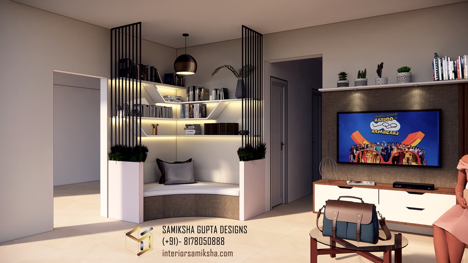
Personally, I really liked this concept.
I liked the design, the overall look, and the feel of the space.
There was just one problem.
It didn’t have the seating capacity of 3-4 people. Instead, it offered a very cosy, very designer space for one person.
But we knew we were coming close to our final design. We understood the basic structure of our seating, and we also understood that adding partitions would limit the seating capacity, so we might as well have to skip it.
Design 5
Keeping the overall furniture as it is in the setup, I essentially removed the partitions from both sides and added a cushioned backrest with the L-shaped seating for extra comfort.
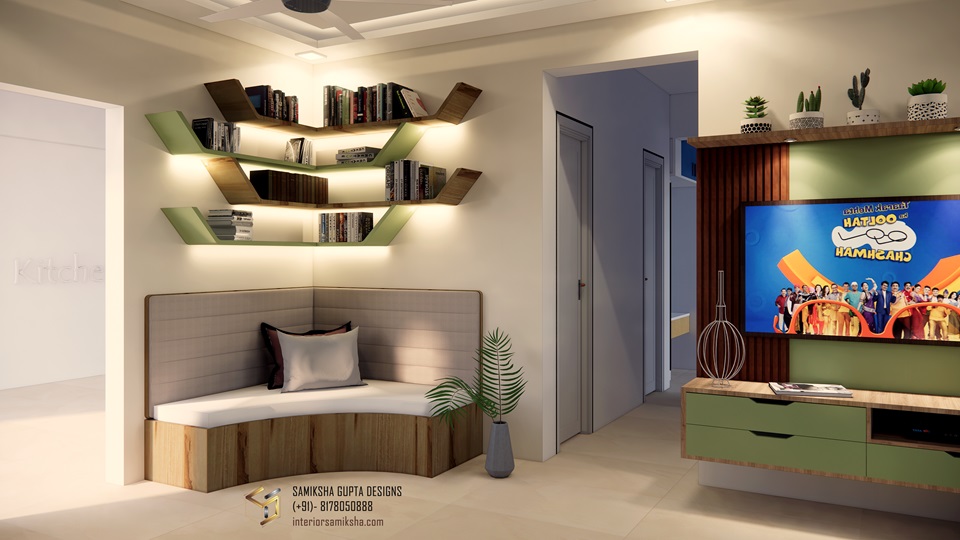
The extra curves in the L-shaped seating and the shelves corners added a sense of comfort and cosiness.
Finally, we knew what we wanted.
And…
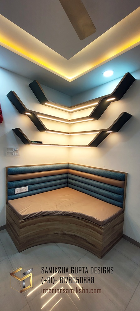
This became the highlight of the house!
What do you think of this design journey?
Did you like any other design from the initial drafts better?
Let me know your views in the comments below!

