Every home tells a story through its spaces. For this client’s apartment in Life Republic, the brief was simple — create a crockery unit that feels elegant, functional, and blends seamlessly with the rest of the home interiors.
But even with a compact area, there’s always room for thoughtful design.
Exploring Two Distinct Concepts
We started with two design directions for the crockery unit, each with its own personality.
Option 1 — The Soft Green Palette

The first concept was built around a muted sage green tone with fine vertical textures. The idea was to keep it light, natural, and calm — something that quietly complements the surrounding space. The finishes were chosen to add depth without drawing too much attention: soft lighting within the display units, glass shutters, and minimal hardware.
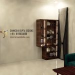
Option 2 — The Blue & White Contrast

The alternate design took a bolder approach. We introduced a blue and white combination paired with a botanical print backsplash, bringing freshness and a hint of playfulness to the dining area. This version felt energetic and expressive — a beautiful option for someone who enjoys statement design elements in their space.
The Final Choice
After reviewing both versions, the client chose the subtle green concept.
Its understated elegance and soothing tone resonated better with the home’s overall mood — creating a sense of visual continuity and balance.
This project reaffirmed something I deeply believe in: design doesn’t always need to shout to be impactful. Sometimes, the most peaceful choices leave the most lasting impressions.
Project Details
📍 Life Republic, Pune
🎨 Design Concept & Visualization by Samiksha Gupta Designs
📞 +91 8178050888
🌐 interiorsamiksha.com
Related posts:
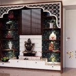 Designing with Purpose: A Mandir Project Beyond Compensation
 Choosing the Perfect Crockery Unit: 3 Stylish Design Options That Complement Your Living Room
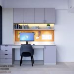 Designing Functional Workspaces: A Renovation Project at Celestial City, Ravet
 How Long Does It Take for an Interior Designer to Complete a Project?