In interior design, it’s often the smallest details that create the biggest impact. A well-designed dining wall doesn’t rely on bold statements or excessive décor—it works quietly in the background, supporting the space both visually and functionally.
This article walks through the design process behind a modern dining wall with a tall crockery cabinet, showing how working backwards—from intent to execution—helps create interiors that feel balanced, timeless, and livable.
Why the Dining Wall Matters in Interior Design
The dining area is a transitional space. It connects daily routines with moments of pause—meals, conversations, and gatherings. Unlike a living room feature wall, a dining wall needs restraint. It should complement the space without competing for attention.
A thoughtfully designed dining wall:
-
Anchors the dining area visually
-
Adds storage without clutter
-
Enhances lighting and spatial depth
-
Ages well over time
The challenge is achieving all this without overwhelming the room.
Designing Backwards: Starting With the Final Feeling
Instead of beginning with materials or finishes, this design started with a simple question: How should the space feel?
The desired outcome was calm, structured, and visually complete. Not decorative. Not trendy. Just resolved.
This clarity guided every decision that followed—what to include, what to avoid, and where to stop.
The Final 3D Visualisation: Balance Over Drama
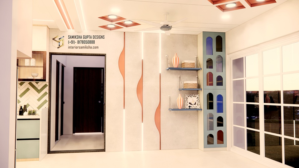
The completed 3D design shows a composed dining wall with:
-
Subtle curved panelling
-
Vertical profile lighting
-
A full-height crockery cabinet placed in the corner
The cabinet anchors the wall, while the curves soften the geometry. Vertical lighting adds rhythm and height, drawing the eye upward without being harsh. Nothing here is accidental, but nothing shouts for attention either.
This balance is essential in dining spaces, which are meant to be lived in daily.
Breaking the Wall Into Functional Layers
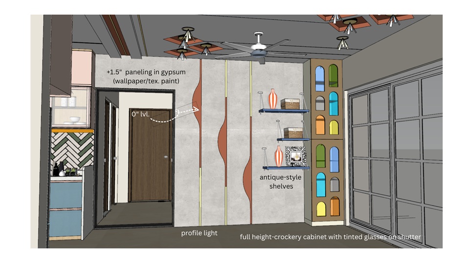
Once the overall intent was established, the wall was broken down into layers—each serving a specific purpose.
Gypsum Panelling for Depth
Gypsum panelling was used to introduce depth without adding bulk. Instead of flat surfaces, controlled offsets create shadow lines that add dimension subtly.
Profile Lighting for Visual Rhythm
Vertical profile lights were integrated into the panelling to create a soft ambient glow. Unlike decorative lights, these are architectural—they enhance form rather than act as focal points.
Curved Detailing for Softness
The wave-like curve detail was carefully calibrated. Too subtle, and it disappears. Too strong, and it dominates. Its role was to soften the vertical lines and prevent rigidity.
Open Shelves Used Sparingly
Open shelves were included only where they added breathing space. Their scale and placement were intentional, ensuring they don’t turn into visual clutter over time.
Crockery Cabinet for Storage and Structure
The tall crockery cabinet serves both functional and spatial roles. Positioned in the corner, it maximizes storage while framing the wall. Tinted glass shutters keep the cabinet visually light while concealing everyday items.
Material Coordination: Quiet, Not Loud
Material selection focused on cohesion rather than contrast. Finishes were chosen to sit comfortably together, avoiding sharp transitions.
The goal wasn’t to highlight materials individually, but to let them work as a collective backdrop. This approach ensures longevity and reduces the risk of the design feeling dated.
The Raw SketchUp Model: Where Design Is Tested

Before any textures or finishes were applied, the entire wall existed as a raw SketchUp model.
This stage is critical in interior design.
Without colours, lighting effects, or materials to rely on, the design must stand on:
-
Proportions
-
Alignment
-
Scale
-
Spatial flow
If something feels off here, no amount of styling can fix it later. This phase forces discipline and clarity—qualities that often get lost when designers jump too quickly into finishes.
Why Restraint Is a Design Skill
One of the most overlooked skills in interior design is knowing when to stop.
Not every wall needs:
-
A texture
-
A niche
-
A decorative panel
In fact, over-designing often leads to visual fatigue. This dining wall works because of what was left out as much as what was included.
Restraint allows the space to breathe.
Designing for Everyday Living
Interior design is not about impressing once—it’s about supporting daily life.
This dining wall was designed with real use in mind:
-
Easy maintenance
-
Functional storage
-
Lighting that’s pleasant over long durations
-
A design that doesn’t demand constant styling
When spaces are designed with longevity in mind, they remain relevant long after trends fade.
Why Process Matters More Than the Final Image
The final 3D render is only the visible result. What truly defines the quality of a design is the thinking behind it.
Working backwards—from intent to execution—ensures that every detail has a reason to exist. It keeps the focus on function, feeling, and coherence rather than decoration.
Conclusion: Small Details, Lasting Impact
A dining wall doesn’t need to be loud to be impactful. When I get the proportions right, plan lighting intentionally, and integrate storage thoughtfully, the space feels complete without trying too hard.
This project is a reminder that good interior design is not about adding more—it’s about refining what’s already there.
And often, it’s the smallest details that make all the difference.
wish you all the best
Very good i like it