When we talk about interior design, most people immediately think about furniture layouts, colour palettes, or maybe flooring options. But ceilings — especially rendering false ceiling — often play a quiet yet transformative role in shaping a space. They add dimension, enhance lighting, and create a cohesive visual flow in a room.
Recently, I worked on a 3BHK apartment at Skyscrapers, Tathawade, and one of the key design challenges was the living room false ceiling. I developed three distinct design options for the client to choose from — each with its own rhythm, lighting approach, and mood.
But here’s the catch: this was my first time rendering from the floor upward, trying to simulate ceiling details in 3D. And let me tell you — it’s a whole different ball game.
The Learning Curve
I’ve done countless renderings before, but mostly from conventional angles — eye-level, isometric, or top-down. Shifting the perspective upward introduced unexpected lighting challenges. Shadows behaved differently, light sources didn’t reflect as naturally, and balancing realism with clarity became a puzzle.
The renders came out… patchy. Not unworkable, but not portfolio-perfect either.
Still, I chose to share them.
Because design is a process. And growth doesn’t happen behind polished images — it happens in moments like these, when things don’t go quite right but you keep moving anyway.
The Designs
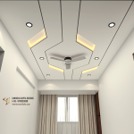
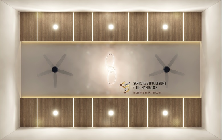
Option 1: Zig-Zag Ceiling with Profile Lights
This design features a dynamic zig-zag layout with integrated profile lighting to create a bold, graphic ceiling statement.

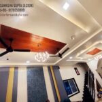
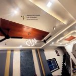
Option 2: Parallel Ceiling with Wooden Finish
A more structured, balanced look with parallel layers and a warm wooden finish (with the option to use wallpaper to keep it cost-effective).

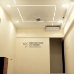
Option 3: Simple Peripheral Ceiling
A clean, understated design with a straight-line profile light and subtle cove lighting framing the edges — perfect for a soft, ambient glow.

Reflection
While I won’t say these were my finest renders, they taught me more than many successful ones have. The client did choose one of the options — I’ll let you guess which 😉 — and we were able to move forward with a clear, approved direction.
I’m sharing this here not just to showcase the designs, but to remind fellow designers (and myself) that it’s okay to share work that’s imperfect. The process matters just as much as the polish.
What’s Next
I’m already reworking my rendering workflow for upward angles and have started testing better lighting strategies. Growth is in motion.
If you’re in the field — or just design-curious — I’d love to hear:
👉 Which of the three designs do you like best?
👉 Have you ever shared something before it was “perfect”? How did that feel?
Thanks for reading.
Until the next challenge,
Samiksha Gupta
Interior Designer | Pune