Whenever I am approached by a client for interior design, their first request is to design their living room as impeccably as possible. They want their living room to look perfect. Often, they are also ready to put in a major part of their budget in creating a perfect living room interior design!
The living room is the heart of the home. That’s the first space anyone sees when they enter your house. a living room is a space where you spend the most time with your friends and family. It’s a place to entertain and relax.
It is very important to give careful attention to every element, be it the choices of materials, colours, or even selecting the right lighting and false ceiling designs. In the blog post, I will be taking you through my experience of designing the living room which has gained me a lot of appreciation and compliments.
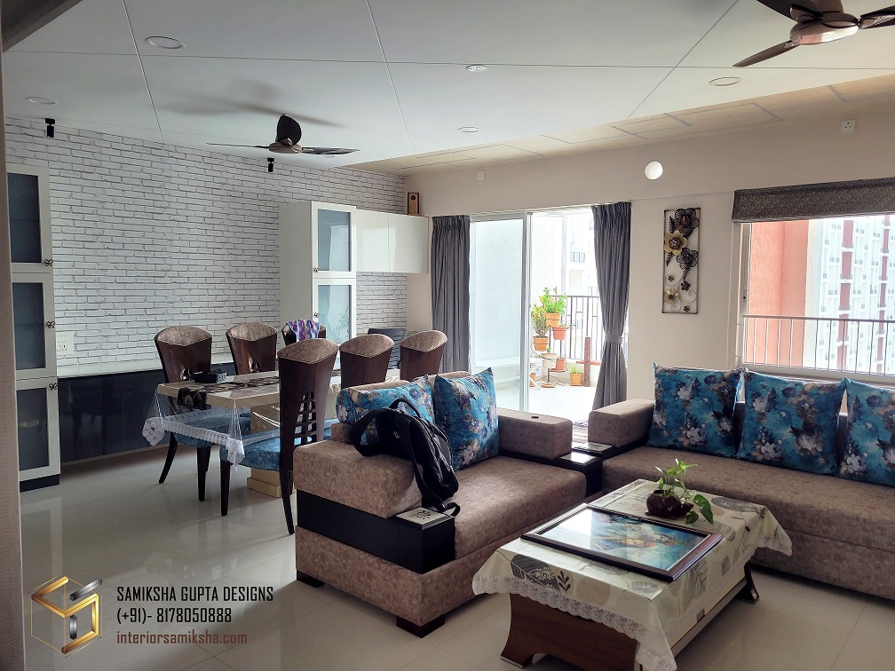
I will tell you about the strategic placement of furniture in the space, and how I incorporated a variety of materials in one space while keeping everything in sync.
Let us begin.
1. False Ceiling and Wallpaper: Unleashing Creativity
False ceilings are no longer just a functional element. They add a touch of sophistication and elevate the overall aesthetics of the space.
A lot of people find it surprising when I tell them that you can treat false ceilings as you treat walls. You can apply trims and mouldings on the false ceiling (of course, we’ve all seen those in traditional interiors), you can use plywood panelling and you can even paste the wallpaper on the ceiling (like I have done here).
The client wanted a wooden look on the ceiling and actual wooden or ply panelling was going out of budget. Hence, we opted for a wooden- look wallpaper with a profile light pattern and it turned out aesthetic!
By applying wallpaper on the ceiling, you can infuse character, depth, and a sense of continuity into the space.
Opt for patterns, textures, or even a simple pop of colour to create a visually stunning impact.
2. Profile Lights: Illuminating with Grace
Profile lights are the epitome of elegance when it comes to illuminating a false ceiling. These sleek and discrete lighting fixtures, embedded within the ceiling, provide the ambient lighting that sets the mood for different occasions.
Use them strategically to highlight architectural details, accentuate artwork, or create a soft, welcoming glow.
The interplay of light and shadow adds depth, making the living room feel more inviting and visually dynamic.
3. Tile Cladding Behind TV: Artistic Flair
Transforming the area behind your TV into a focal point is a clever way to add artistic flair to your living room. Tile cladding offers a unique opportunity to infuse colour, texture, and pattern into the space.
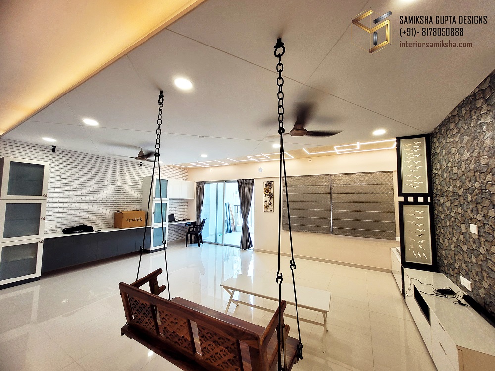
In this project, the client was insistent on using a stone look behind the TV. We explored the option of actual stone cladding, and wallpapers with the stone look, and then finally ended up installing tiles behind the TV.
Whether it’s sleek subway tiles, mosaic designs, or eye-catching Moroccan-style tiles, the possibilities are endless. This striking feature not only protects the wall but also enhances the overall visual appeal of the living room.
4. MDF Partition: Separating Spaces with Style
In an era of open-plan living, creating subtle divisions within a room can be beneficial. A tastefully designed MDF partition can elegantly separate the TV area from a mandir (prayer space) while maintaining a harmonious flow.
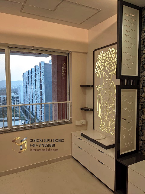
This partition serves as a functional element, offering privacy, while also adding an aesthetic touch. Experiment with geometric patterns, etched designs, or even glass insets to strike a balance between openness and separation.
Here I have used the flying bird cut-out pattern in the partition. This particular design has been quite popular among my clients and I have used this in more than 3 sites now.
5. Colourful Theme: Infusing Vibrancy
A living room should reflect your personality and evoke positive emotions. Embracing a colourful theme can breathe life into the space, making it a joyful and lively environment.
Experiment with a well-coordinated colour palette, incorporating pops of vibrant hues through accent pillows, throws, artwork, or even a statement piece of furniture.
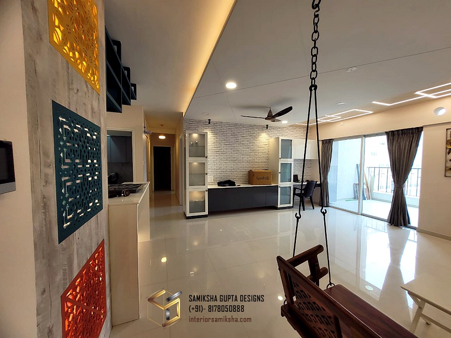
Remember to strike a balance between bold and neutral tones to create a cohesive and visually appealing living room.
6. Breakfast Counter with Moroccan-style Tiles: Exotic Charm
Introducing a Moroccan-style tile design on the front of a breakfast counter injects an exotic charm into your living room.
The intricate patterns and vibrant colours of Moroccan tiles instantly transport you to a faraway land.
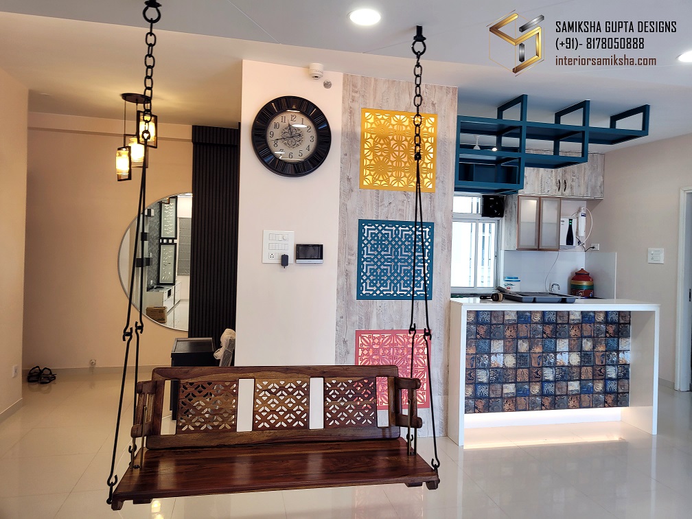
The best experience in this project was selecting the right tiles for the right areas. Everything needed to gel well and complement each other. Selected these colourful tiles for the breakfast counter with a sparkling white quartz countertop.
7. Tall Crockery Units: Stylish Storage Solutions
Storage is essential in any living room, especially when it comes to displaying your prized crockery collection.
Tall crockery units provide an elegant solution, combining functionality with style. Added a long serving counter with a quartz countertop near the dining space. Because we were restricted in the kitchen for a space for a microwave, we provided a provision to keep the microwave over there.
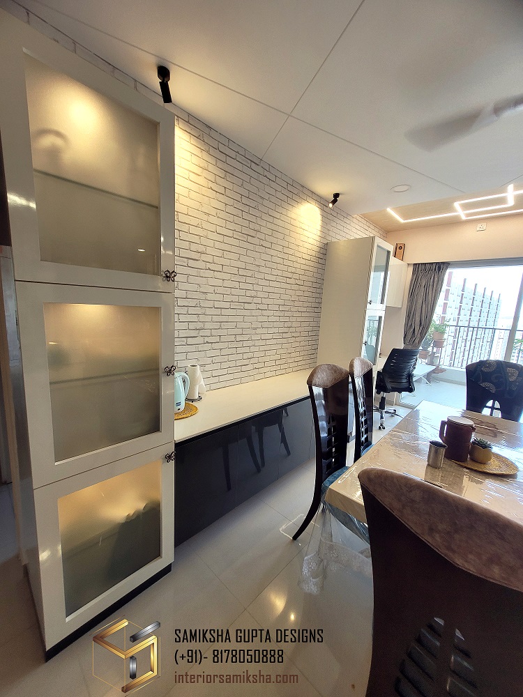
Tall cabinets with frosted glass fronts are a perfect solution when you don’t want to overshow what’s kept inside the cabinets, but also want to add a display and lighting effect in the crockery unit.
Conclusion
Designing the perfect living room interior requires a thoughtful blend of creativity, functionality, and personal style.
Embracing a colourful theme infuses vibrancy into the living room, allowing it to exude positive energy and charm.
Additionally, the wooden jhoola hung in the living room serves as a unique and inviting feature that adds an element of nostalgia and relaxation.
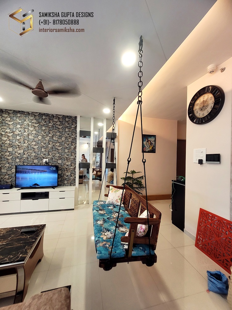
This was a later addition and the overall furniture set-up was revised to accommodate the jhoola properly.
With careful consideration of each element and a harmonious fusion of design elements, you can create a living room that truly represents your style and becomes a cherished gathering place for years to come.
With a lot of design changes and revisions, I completed this project last year with complete satisfaction. All the efforts were worth it in the end.

